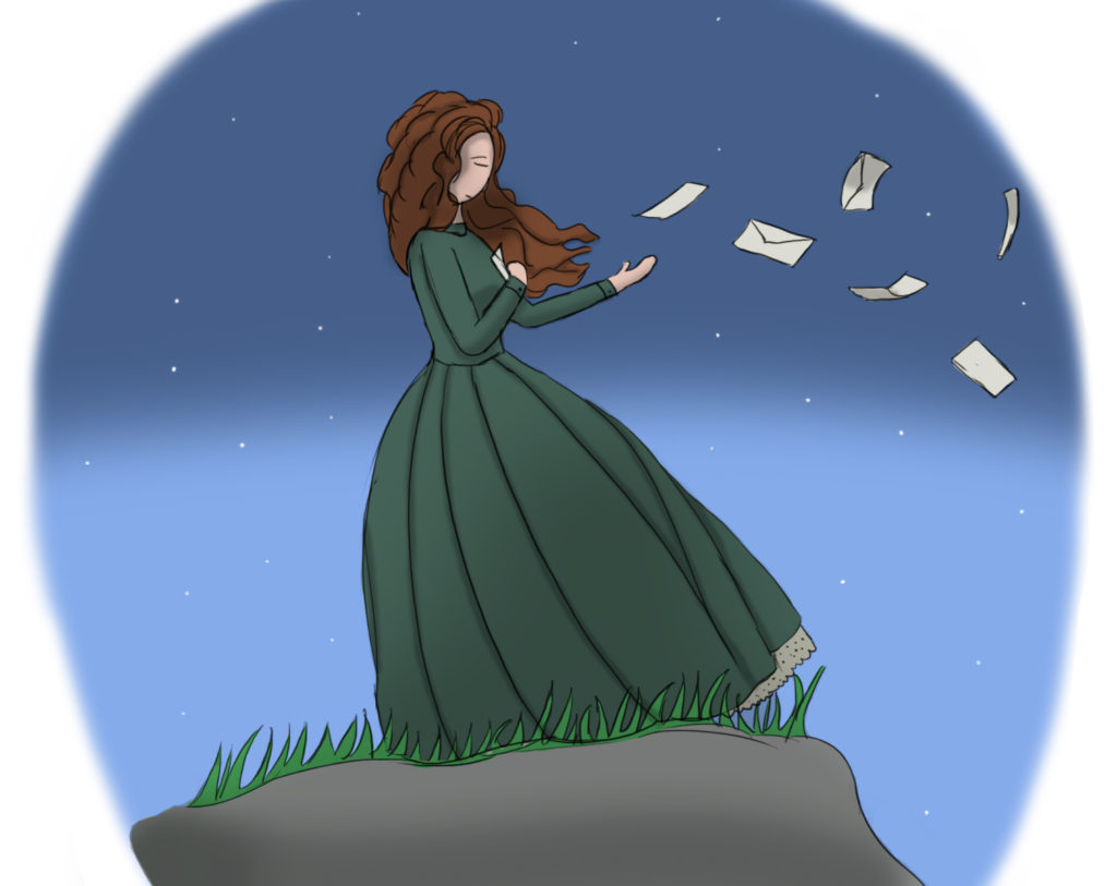
Commission – Say I Love You
This was a commission I did for someone off of Fiverr, for a sample layout of their poem book. This was a bit of fun to do, and I really got a chance to experiment with the background a little. It does look a tad bit wonky in my opinion, and that’s because I think my figures are now starting to take a more realistic slant in proportions. That’s a good thing, I would think; except when you’re halfway in between styles.
